This picture is taken at Telstra on Bourke Swanston street in Melbourne CBD. I like the idea of how the helpful telstra staff are providing instructions and demostration to their customer rather than just posting the QR code advertisement alone, leaving some of the customer being clueless.
Who are the one that uses QR code:
· Place at inappropriate angle and position
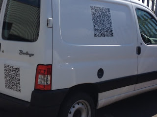
· On moving object
- Transport vehicle (train and bus) or ‘moving’ advertisement on scrolling ads, television or
· QR code that is too small or too big
· Directs to….. ‘Access denied!’ page
The following are some of the bad examples:
These are un-scannable when they are non-human ergonomic and user unfriendly, i.e. bend edges on train and poles. If the code does not do what it is supposed to do, such as providing scans that direct users to a dead URL or misleading link, these simple mistakes can simply led new consumers to have bad impression towards the company and brand. It is important for markets to avoid leaving the users hanging for whatever reason.
Possible things to look at:
· Product nature and their target audience
- Appear to more unsuitable for ads that is targeted at elder people who hardly are smartphone user
· Appropriate setting on appropriate object
- Place a QR code on MX newspaper mainly distribute to commuters after working hour in weekdays instead of a billboard
· Provide instruction if possible
- They must be simple, clear and easy to understand (preferably with the use of graphic)
· Proper testing
- Before introduce the QR code to the market, marketers have to verify the QR code is properly and accurately interpret that data after it has been scanned to ensure the desired experience is delivered.
· Ensure the scan will direct to a mobile-optimised webpage
· DO NOT REPEAT those that mentioned in the ‘BIG NO-NO’ in the previous paragraph.
Further evaluation
In this new era of marketing, the popularity and high exposure rates of QR codes is going to be severely diminished by the user’s annoyance. Marketers require a significant fundamental understanding of consumer behaviour (eg: demographic) before they proceed to use or abuse (in most of the circumstances) QR codes. In using QR codes, companies and marketers need to think carefully how it adds additional value in creative and useful ways and how the end user will receive benefit from it.
I personally would recommend and prefer:
QR code gives benefit (rewards or incentive-based) can have greater consumer intention to try.
· First 100 to scan this QR code, to receive….
· Free product, services or experience
· Lucky draw (enter to stand a chance to win)
· Competition
(the idea of this article is taken from Powershifter, Creativeguerrillamarketing, Mobilemarketer and Comscore.)
Do you personally like the idea of QR code? please have your say!


No comments:
Post a Comment